My Role
UI Design
Prototyping
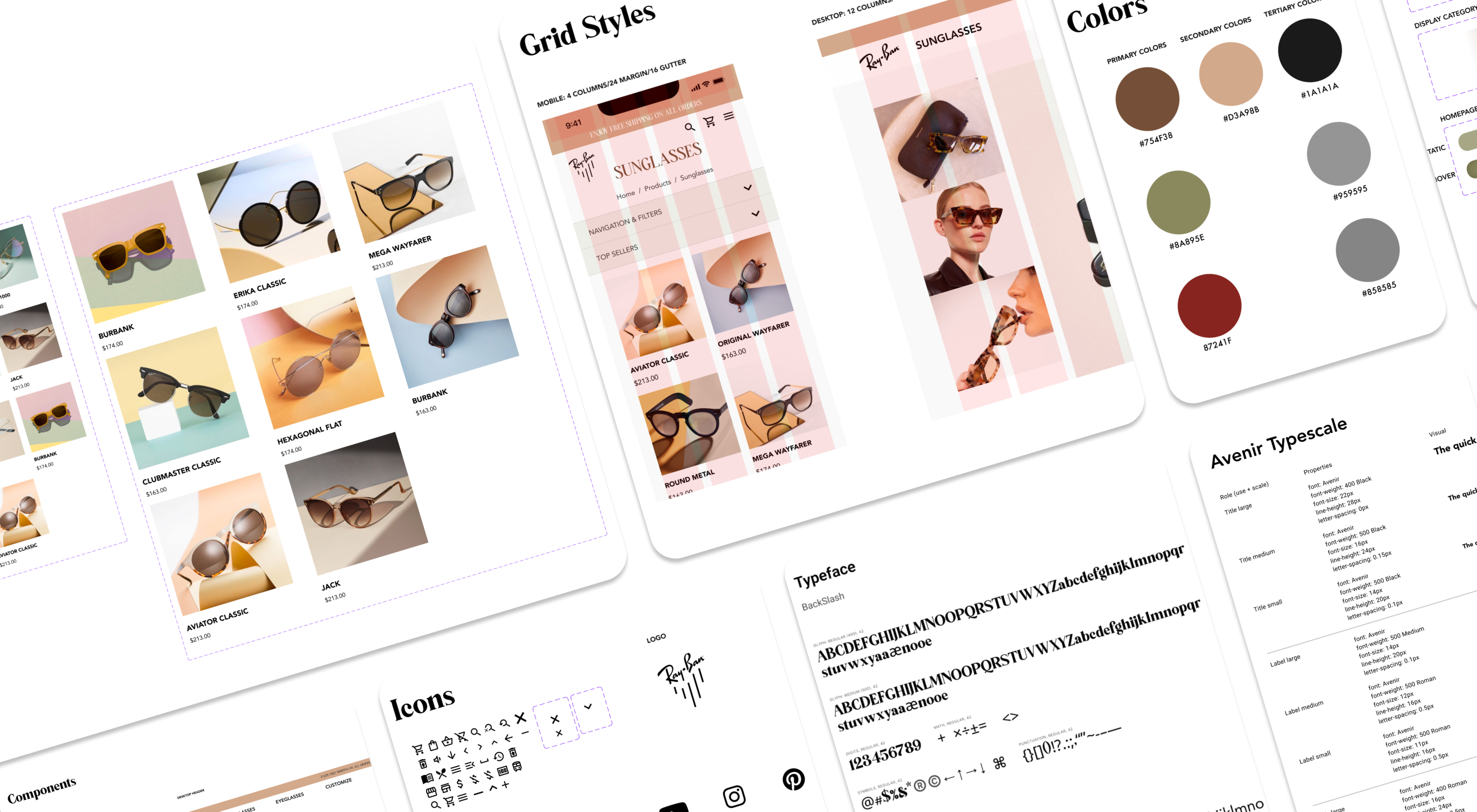
Design Systems
Prototyping
Design Systems
My Team
Elijah Cruzado
Ibtida Hasib
Claire Jung
Michael Kaake
Ibtida Hasib
Claire Jung
Michael Kaake
Duration
4 Months
Tools
Figma
Miro
Adobe CC
Miro
Adobe CC
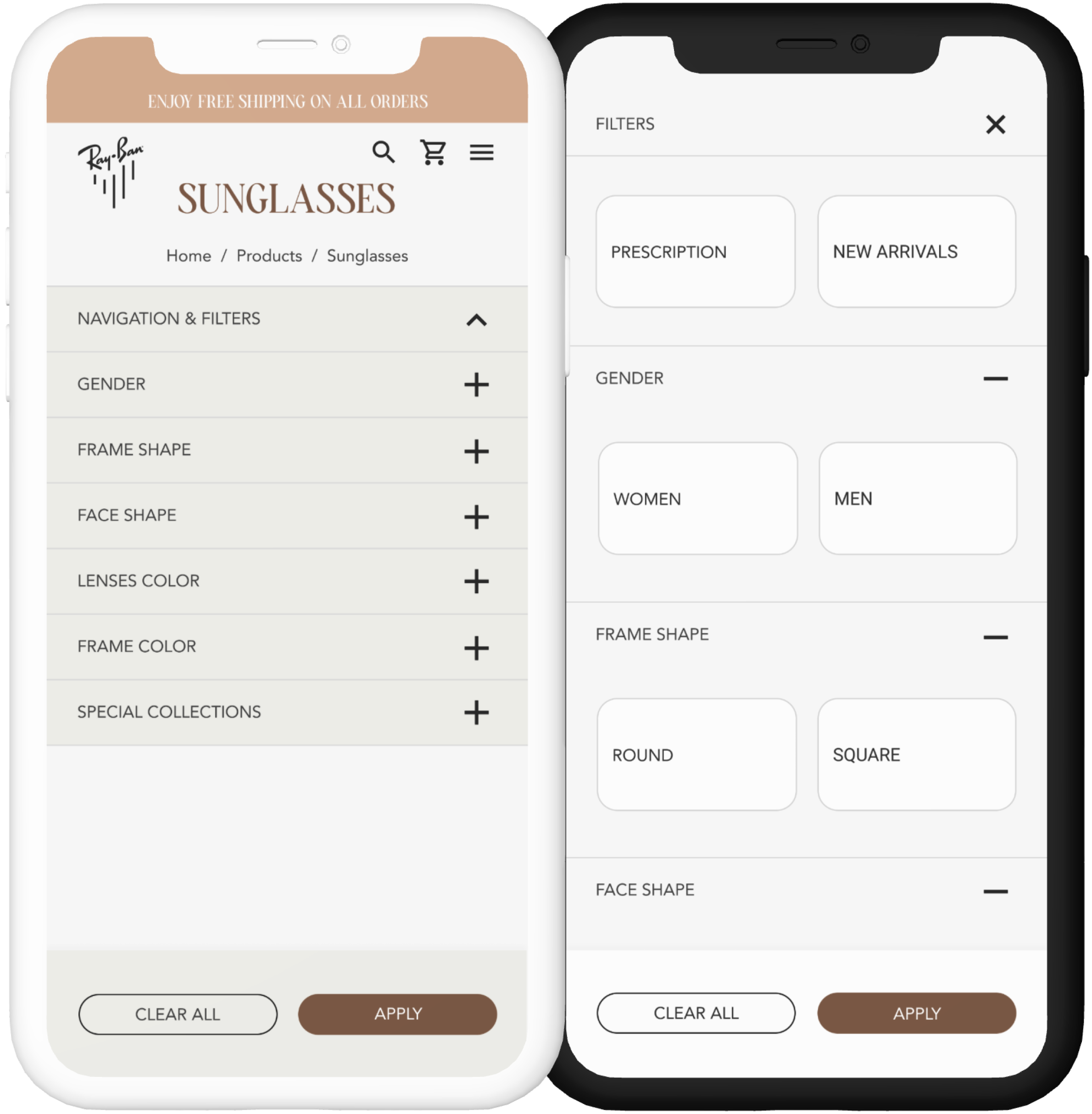
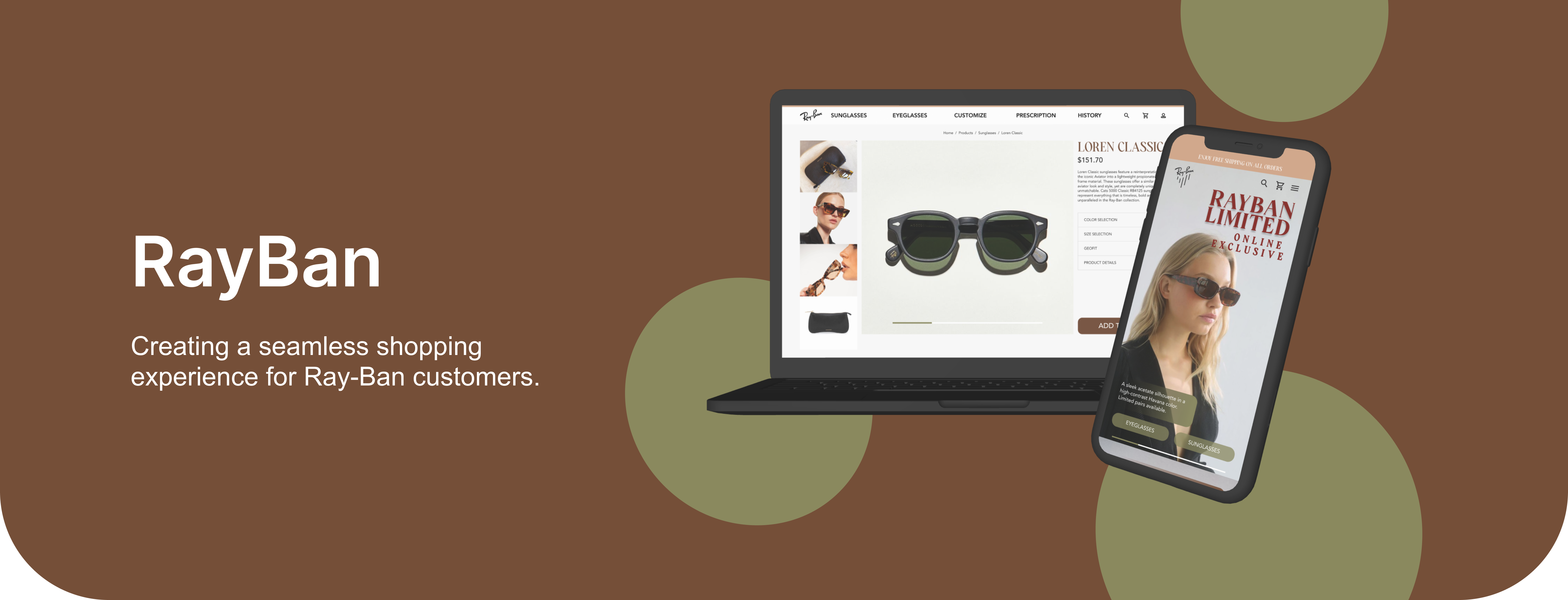
The Problem
There is poor visual hierarchy in the site’s navigation.
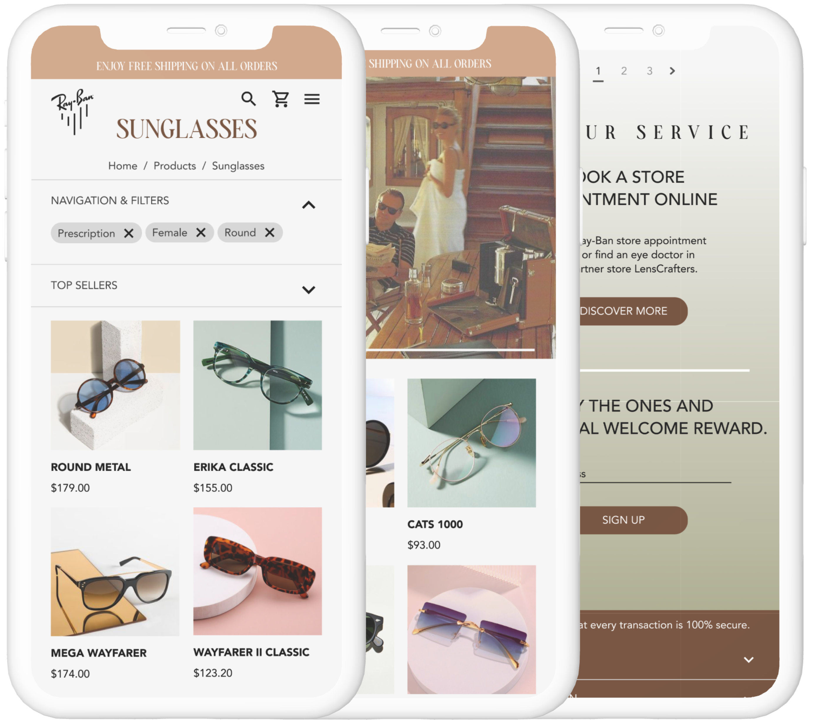
The current product photography is dull, boring, and not engaging.
The current homepage features an overwhelming amount of content, with no clear sense of hierarchy.
The current product photography is dull, boring, and not engaging.
The current homepage features an overwhelming amount of content, with no clear sense of hierarchy.
The Solution
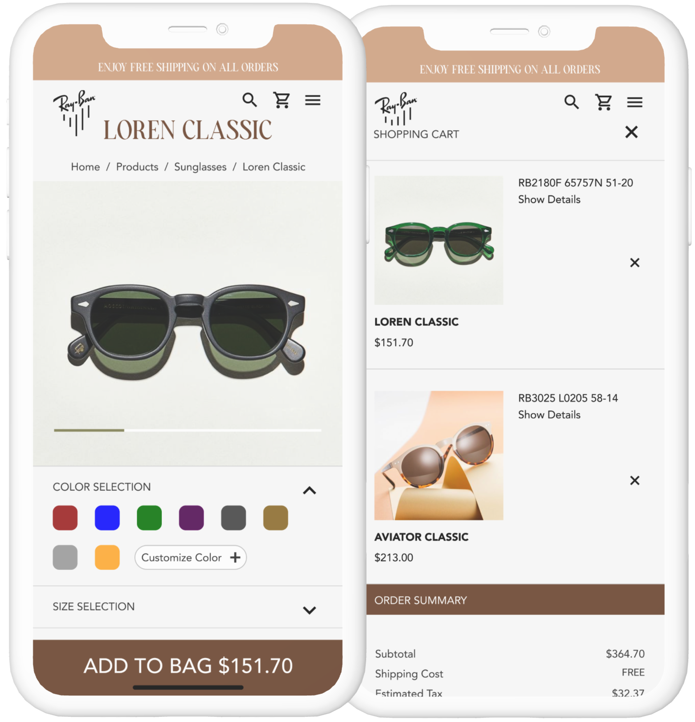
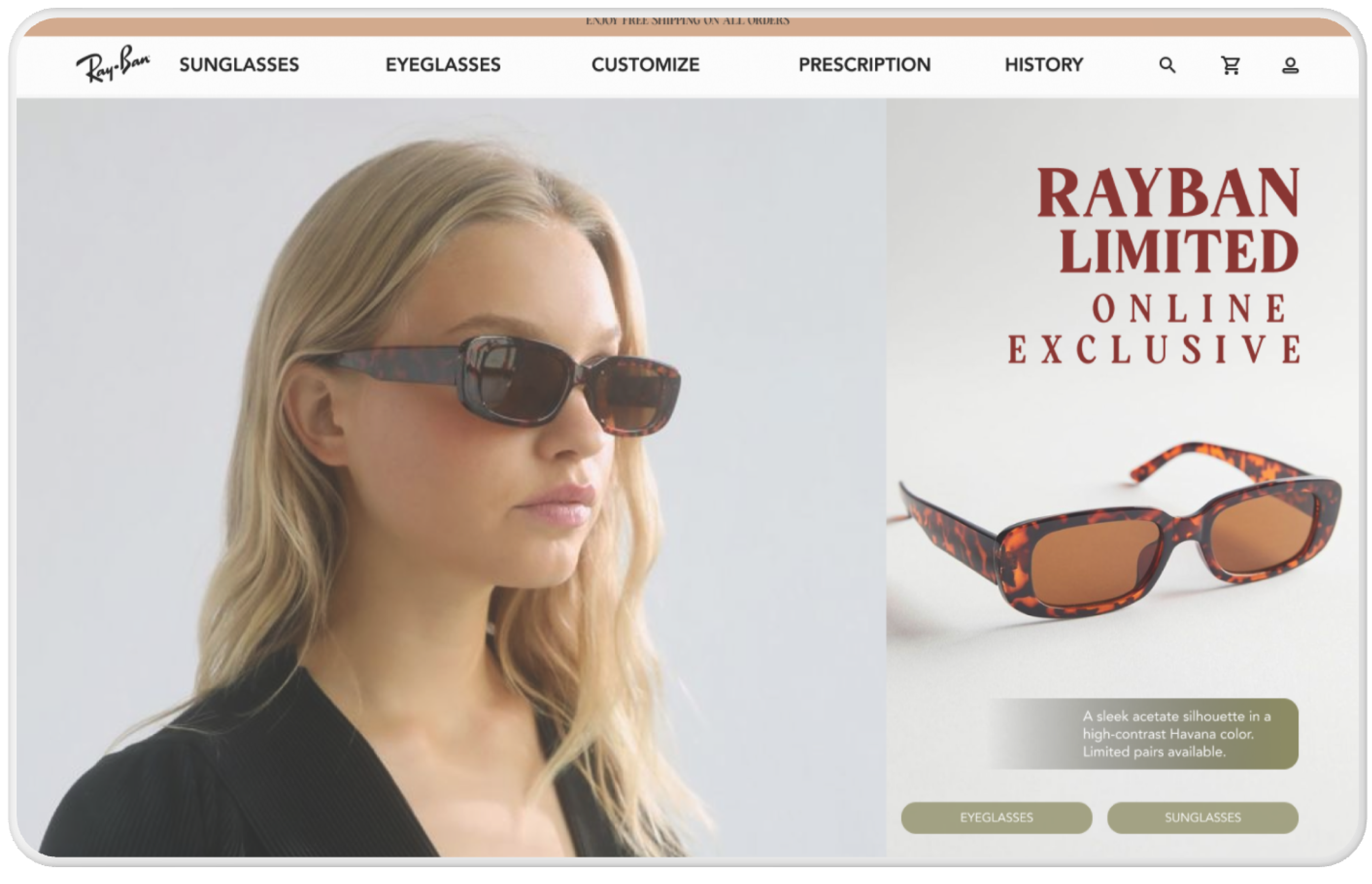
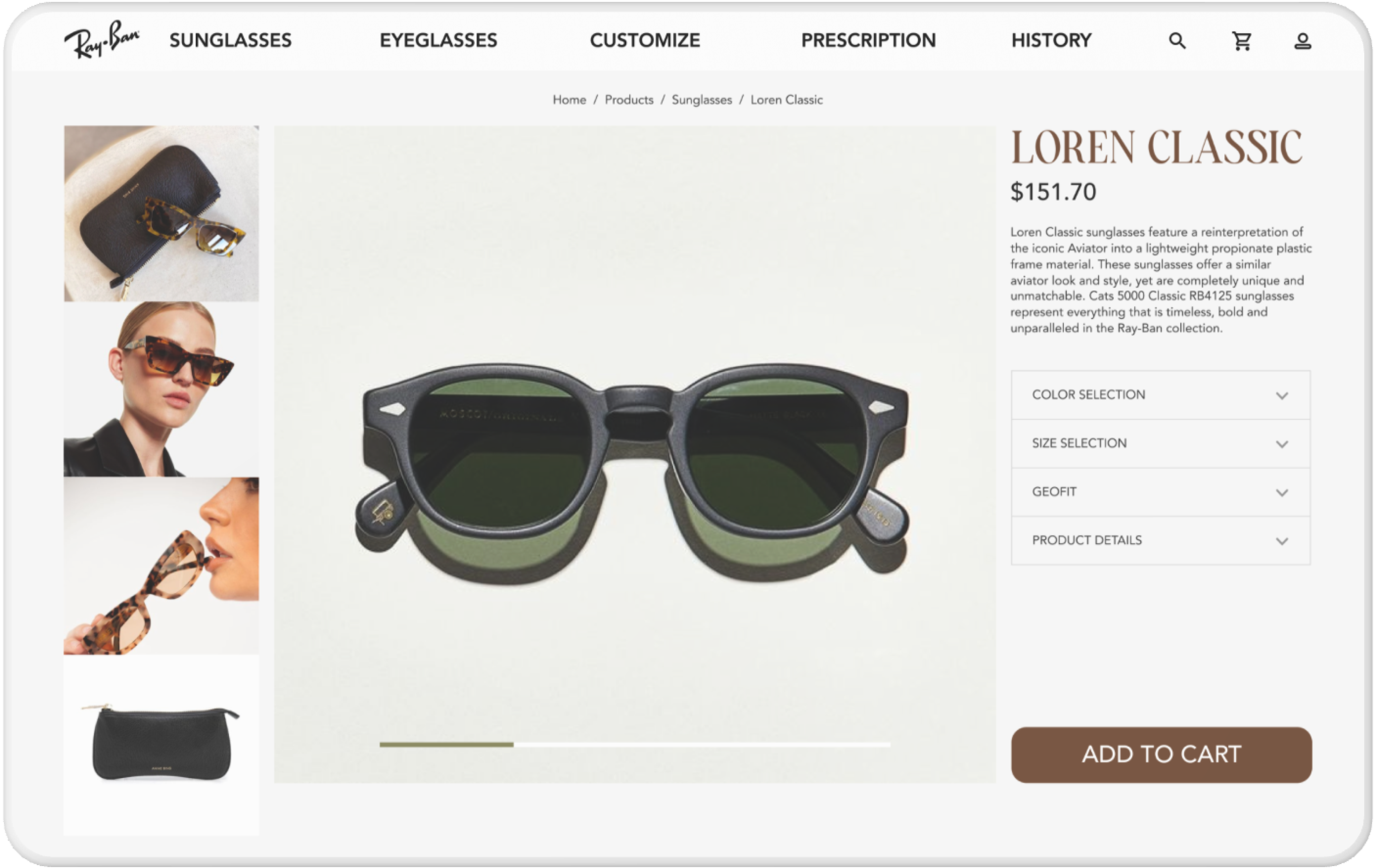
The Ray-Ban website will more mobile friendly by making iconic products pop more, and using dynamic branding elements to invite user interest. Sorting products in a different manner than currently done, making the site easier to browse regardless of the format.

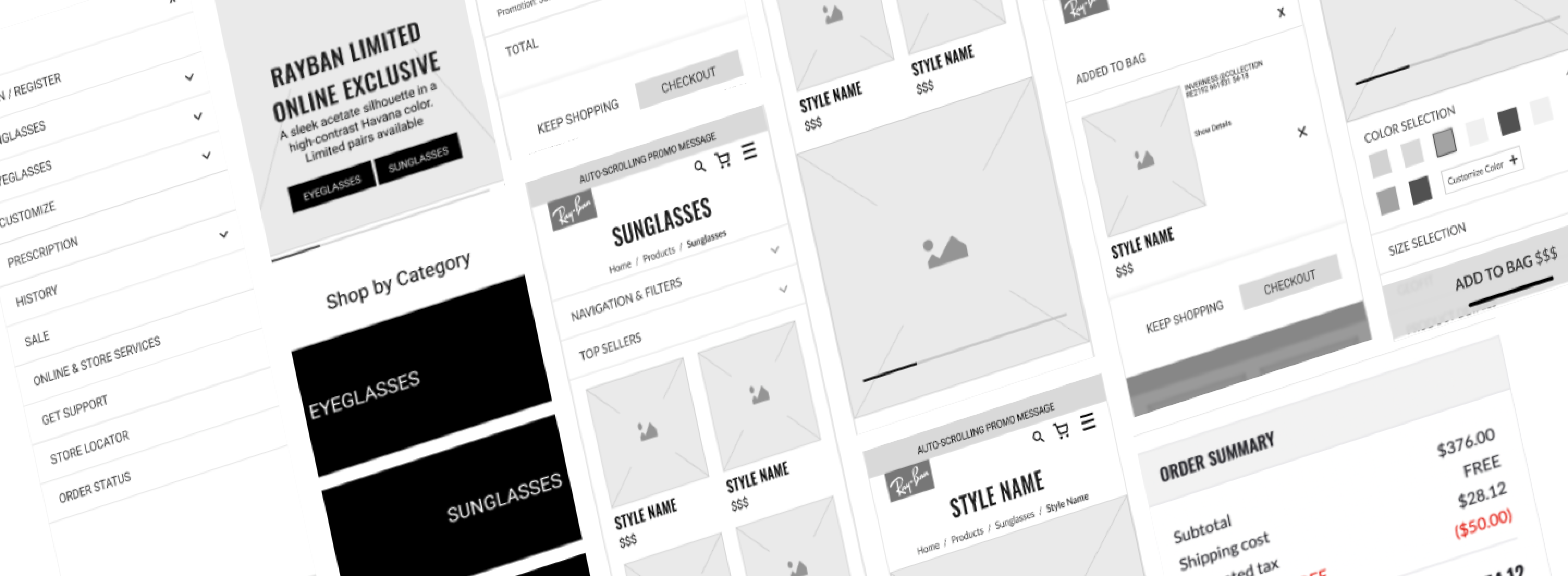
01 Wireframing