My Role
Market Research
Brand Design
Iconography
Brand Design
Iconography
My Team
Elijah Cruzado
Ibtida Hasib
Genevieve Puglissi
Ibtida Hasib
Genevieve Puglissi
Duration
4 Months
Tools
Figma
Miro
Adobe CC
Miro
Adobe CC
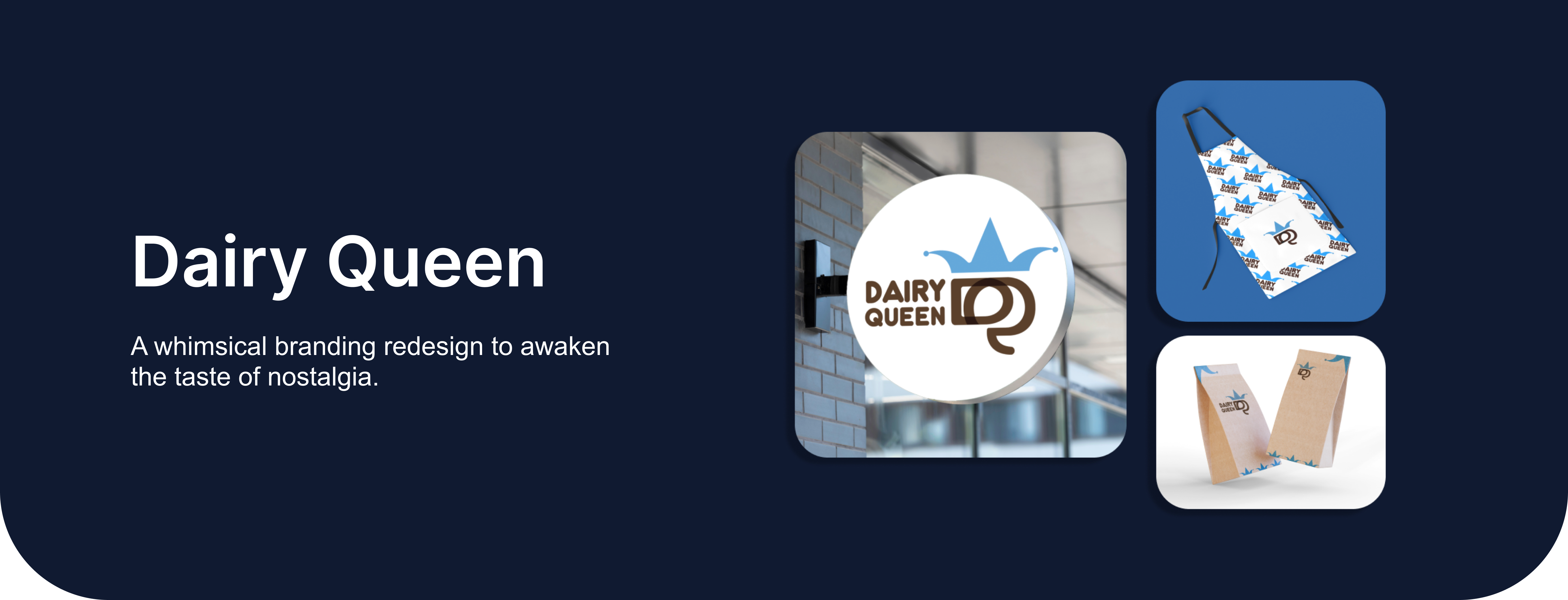
The Problem
The main challenge facing Dairy Queen is the perception of being retro, which means being perceived as old and outdated, potentially limiting accessibility to a broader audience.
The Solution
Dairy Queen wants to spread a savorous impression in a whimsical way. Rebranding allows elevating their look to match their lively vibe, creating a more welcoming environment.

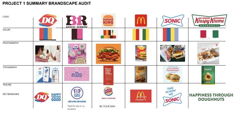
Research & Analysis
Brandscape Audit
We undertook extensive research to analyze current trends, gather insights, and evaluate competitors. I also researched into understanding the brand's personality, positioning statement, and visual identity.
Brand Strategy
Dynamic Branding
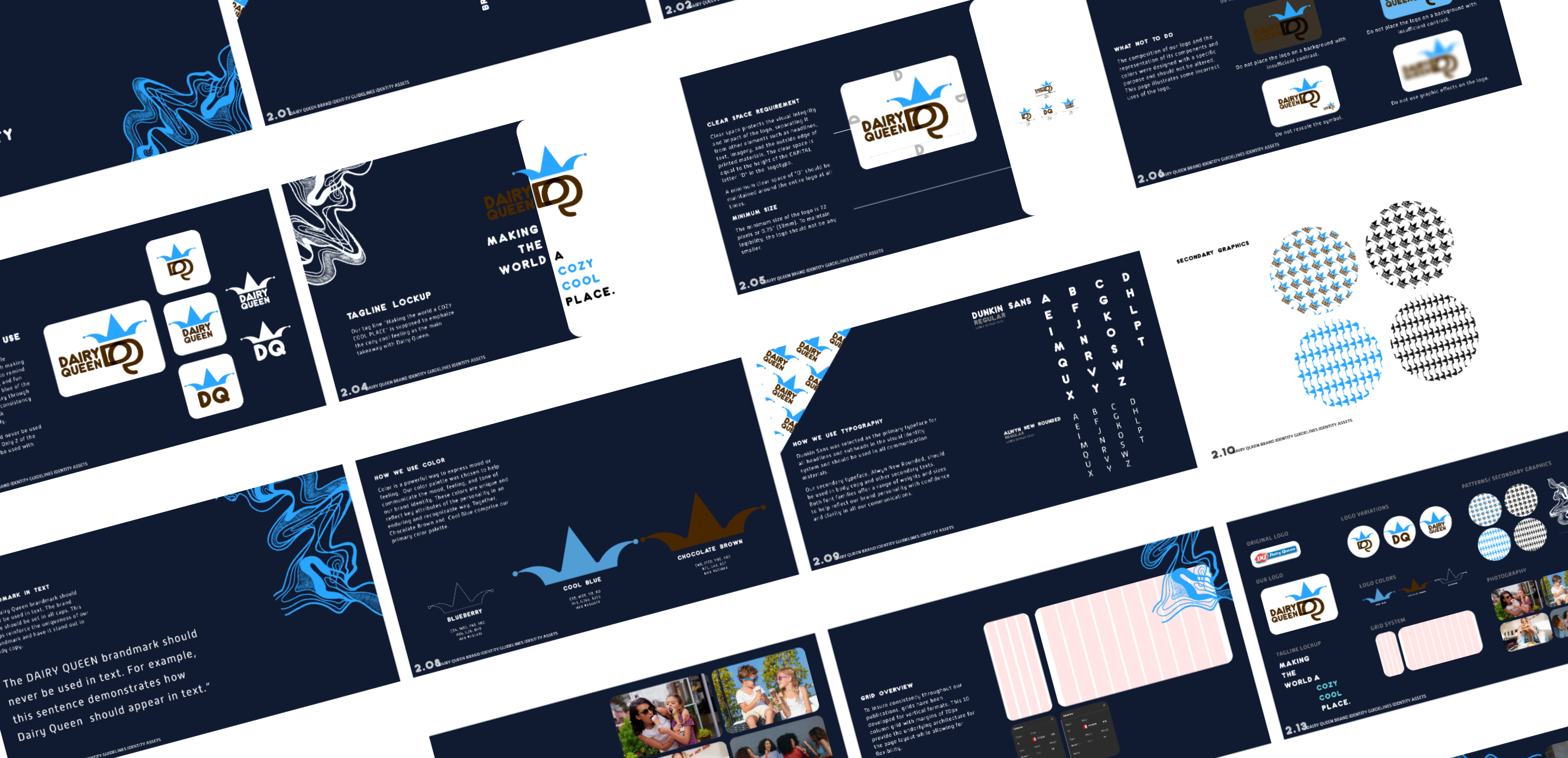
Primary Logo
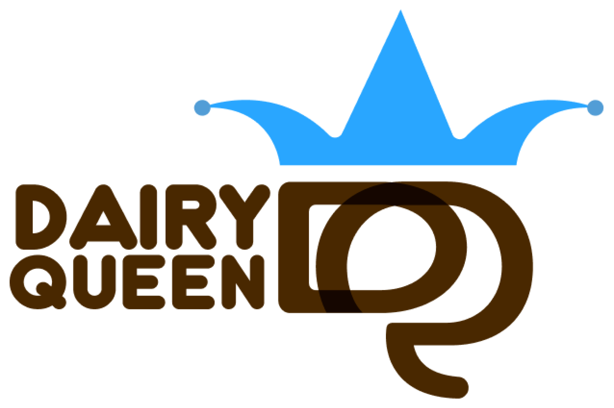
Our primary logo says the whole wordmark: the jester hat glyph making it memorable. It is designed to remind customers of our hospitality and fun nature, while the saturated blue of the coolness. We show symmetry through our logo to represent our consistency and rounded edges to look approachable and friendly.
Our primary logo should never be used on a dark background. Only 2 of the secondary logos may be used with white fill.
Secondary Logo
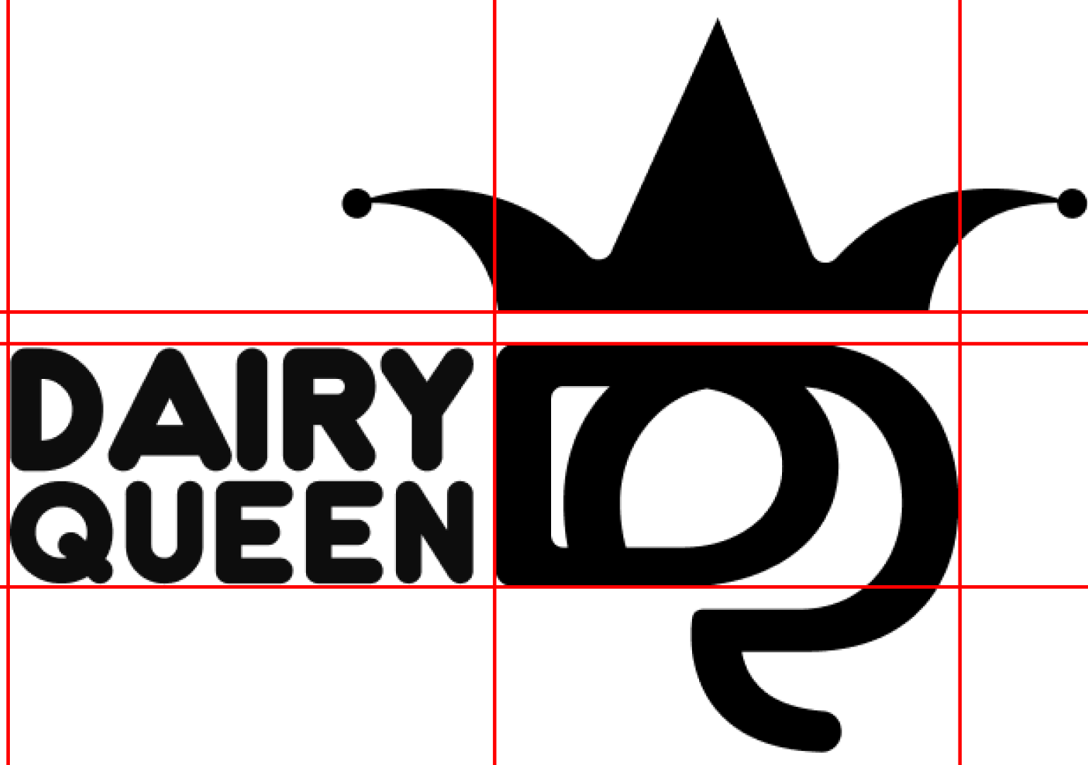
There are 3 variations of our brand mark: The Dairy Queen logo is composed of two elements: the symbol and the Dairy Queen logotype. These two elements maintain a fixed position and size relationship that should not be altered.

Structural Analysis
Clear Space
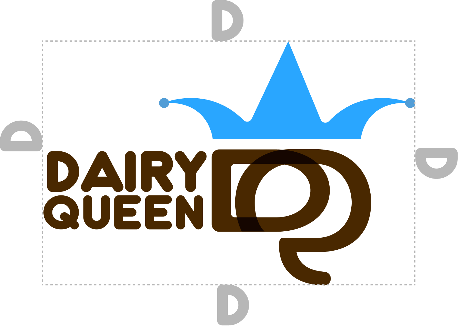
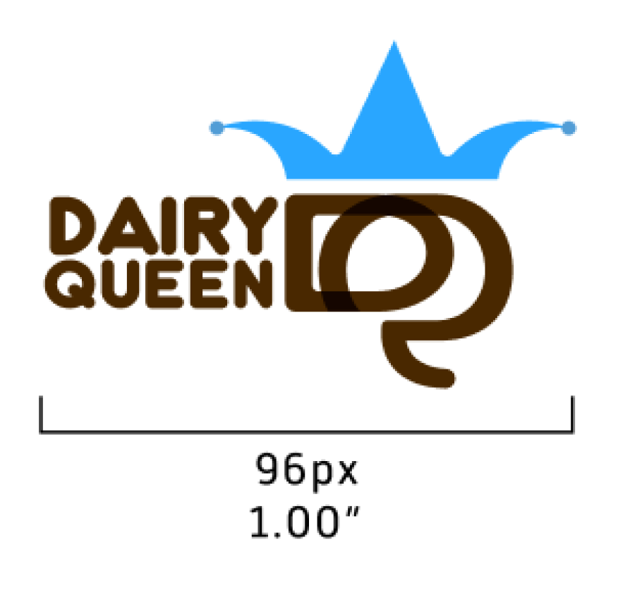
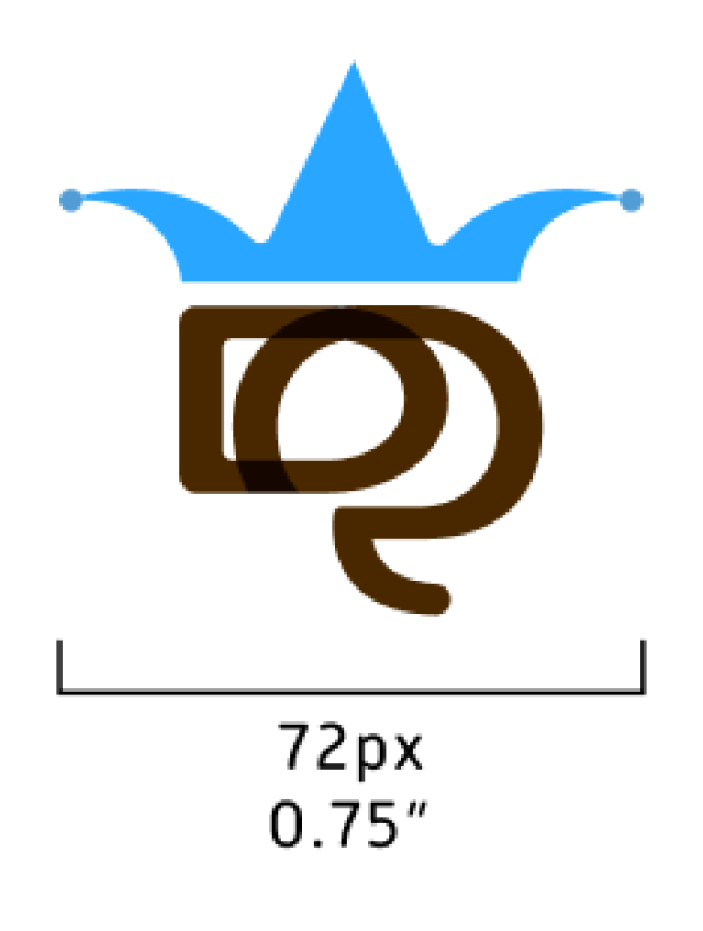
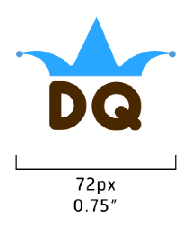
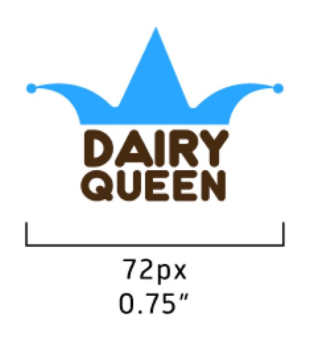
Minimum Size
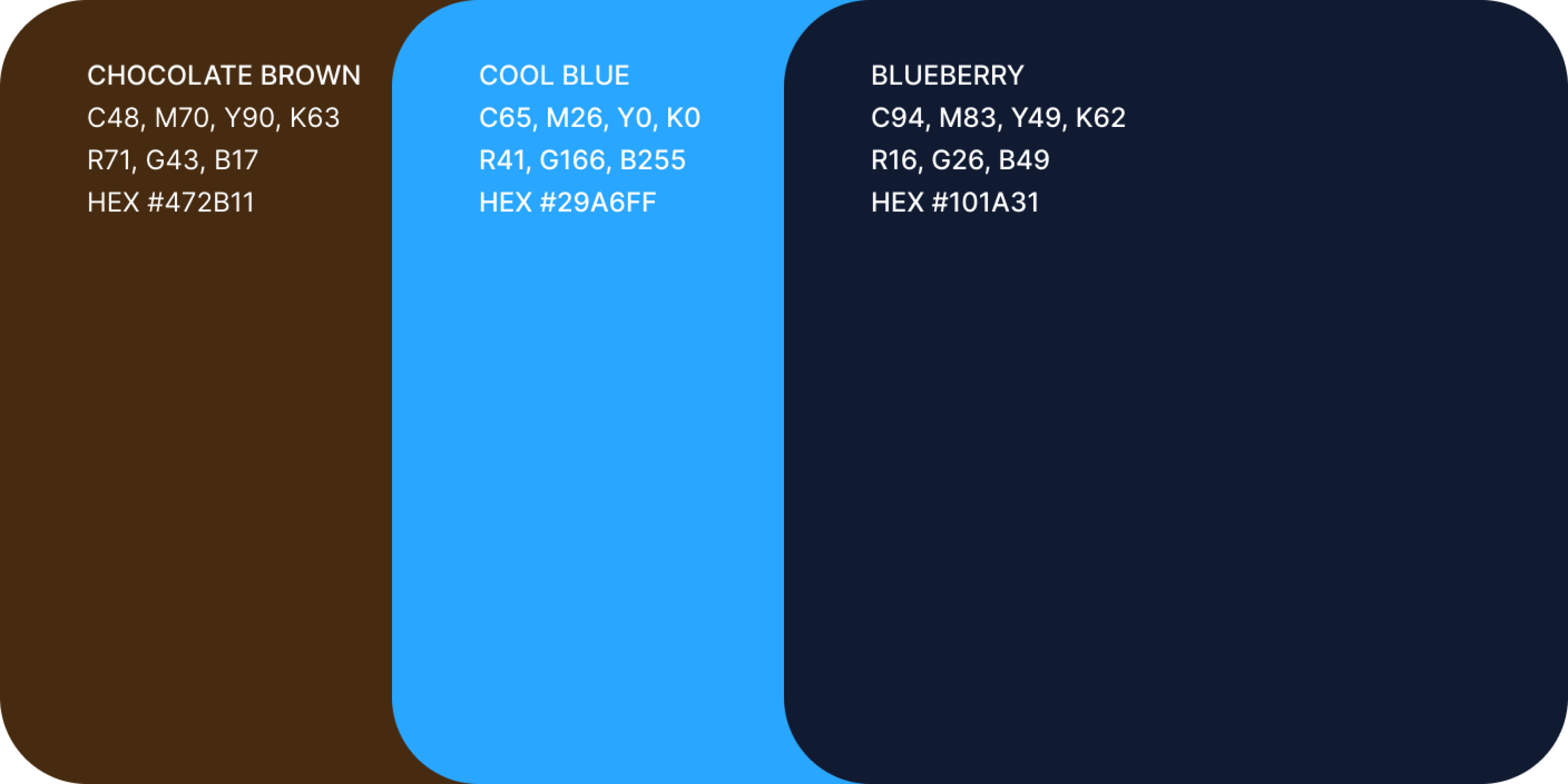
Brand Colors
Color is a powerful way to express mood or feeling.
Our color palette was chosen to help
communicate the mood, feeling, and tone of our brand identity. These colors are unique and reflect key attributes of the personality in
an enduring and recognizable way. Together, Chocolate Brown and Cool Blue comprise our primary color palette.
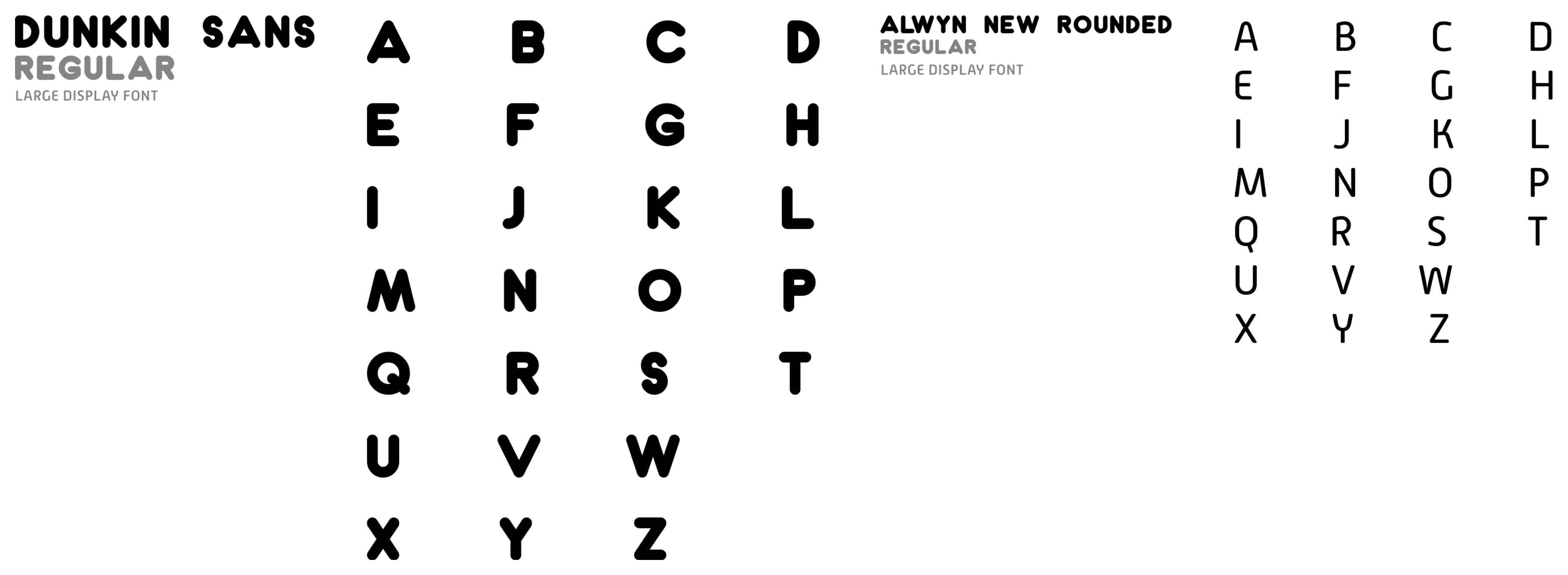
Brand Typography
Dunkin Sans was selected as the primary typeface for all headlines and subheads in the visual identity system and should be used in all communication materials.
Our secondary typeface, Alwyn New Rounded, should be used in body copy and other secondary texts.
Both font families offer a range of weights and sizes to help reflect our brand personality with confidence and clarity in all our communications.
Brand Guidelines